Scottish Rugby Hospitality
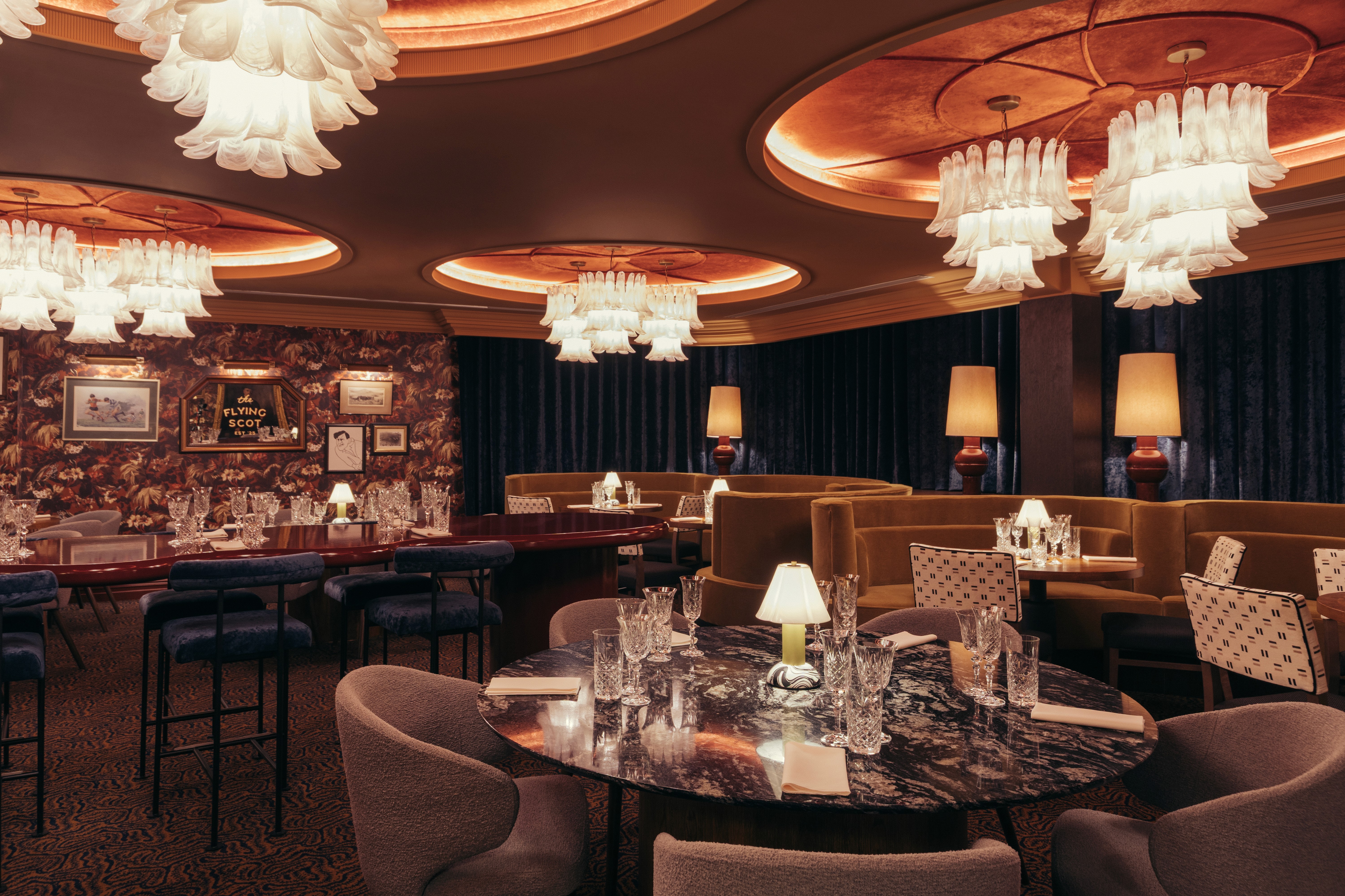
As part of its centenary year, Scottish Rugby set out to elevate the hospitality experience at Scottish Gas Murrayfield through a series of new spaces. We were tasked with developing a micro-brand identity for the 1925 Rooms - a pair of premium environments designed to offer a high-end, luxury experience - before extending our work to The Clubhouse - a large multi-purpose hospitality space.
Work
- BRAND IDENTITY DEVELOPMENT
- LOGO SUITES
- PRINT COLLATERAL
- SIGNAGE & WAYFINDING
COLLABORATORS
- SOLAS SIGNS
- GRAVEN
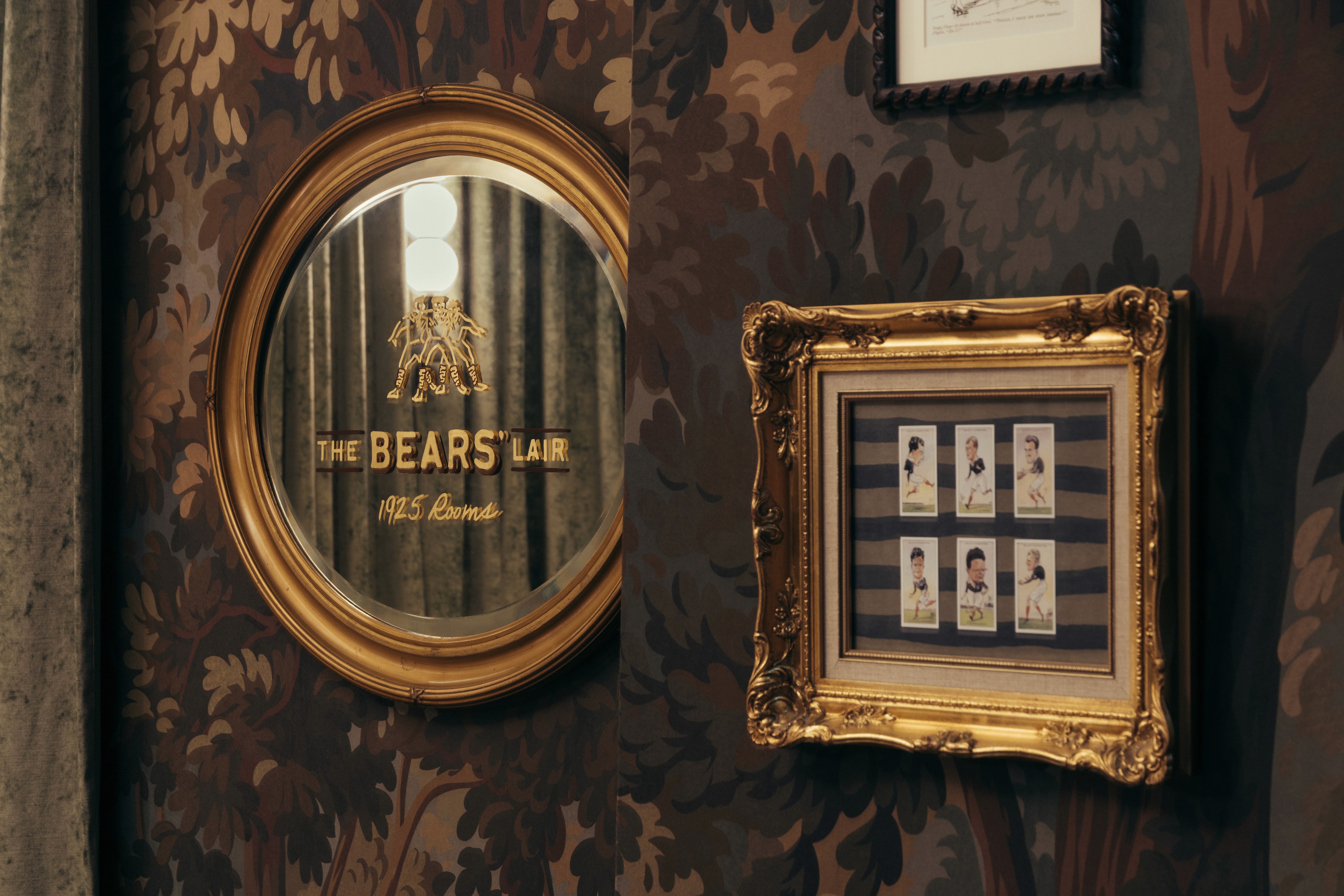
Taking inspiration from vintage typography and modern-retro branding, our approach was rooted in Murrayfield’s archive, drawing on rugby legends, historic artefacts, and ephemera to inform the identity.
our response
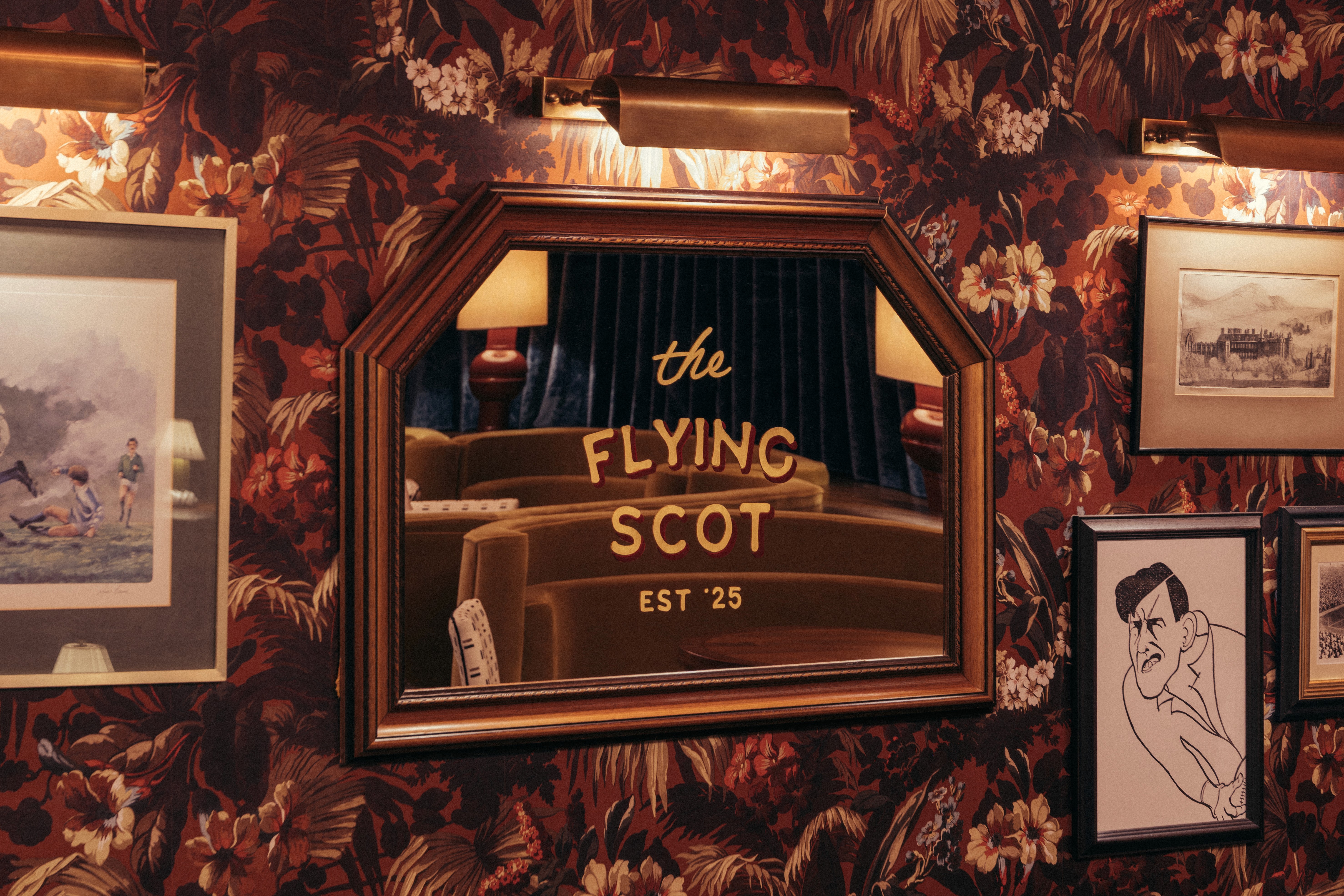
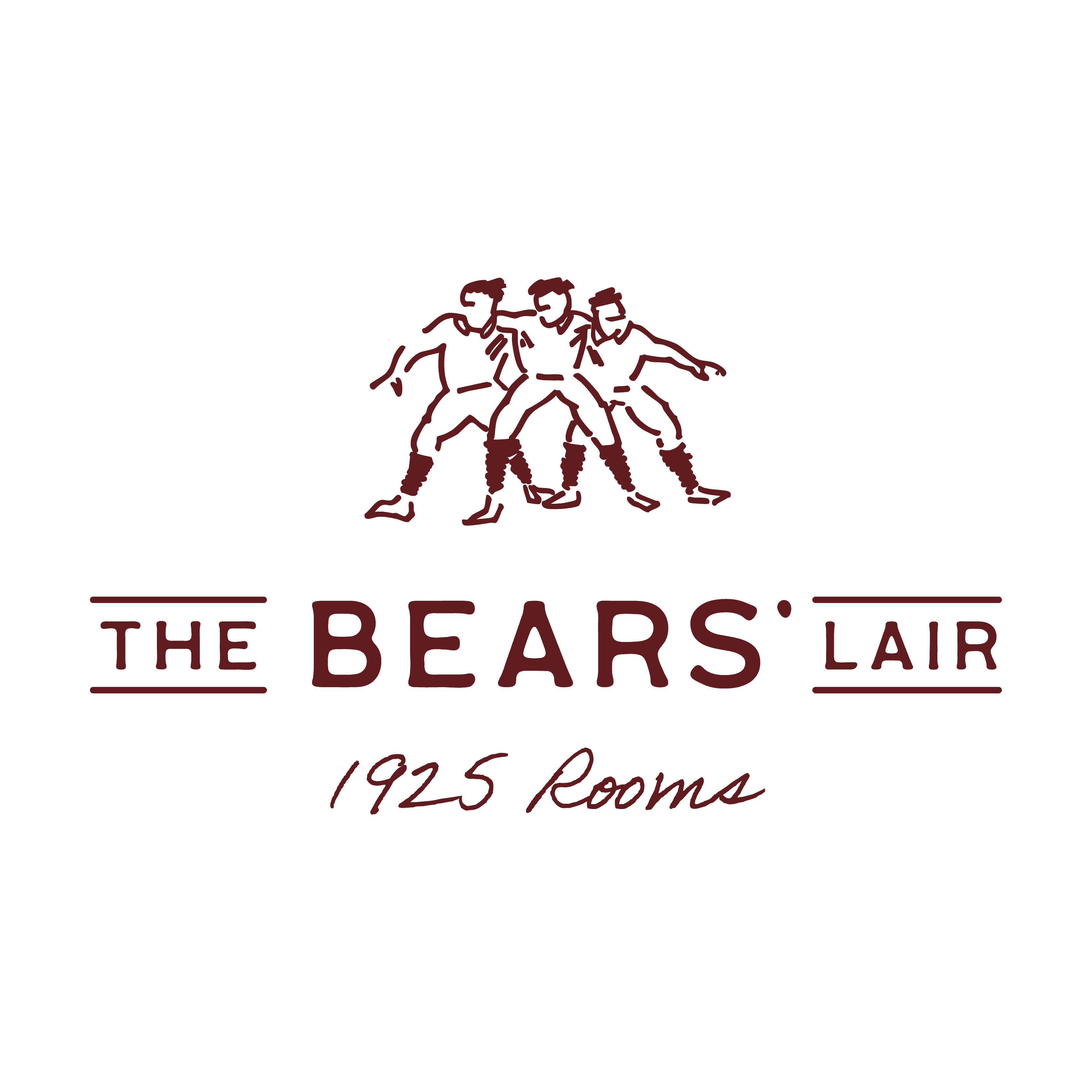
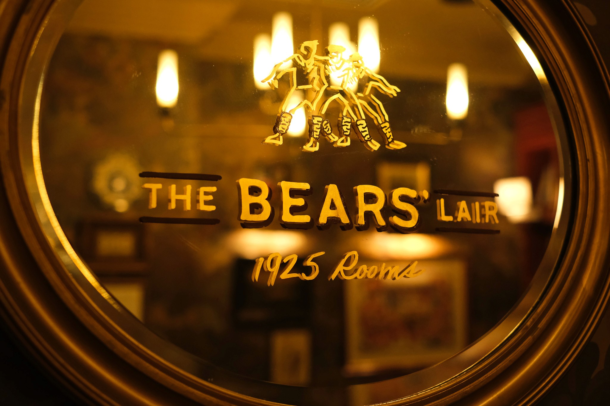
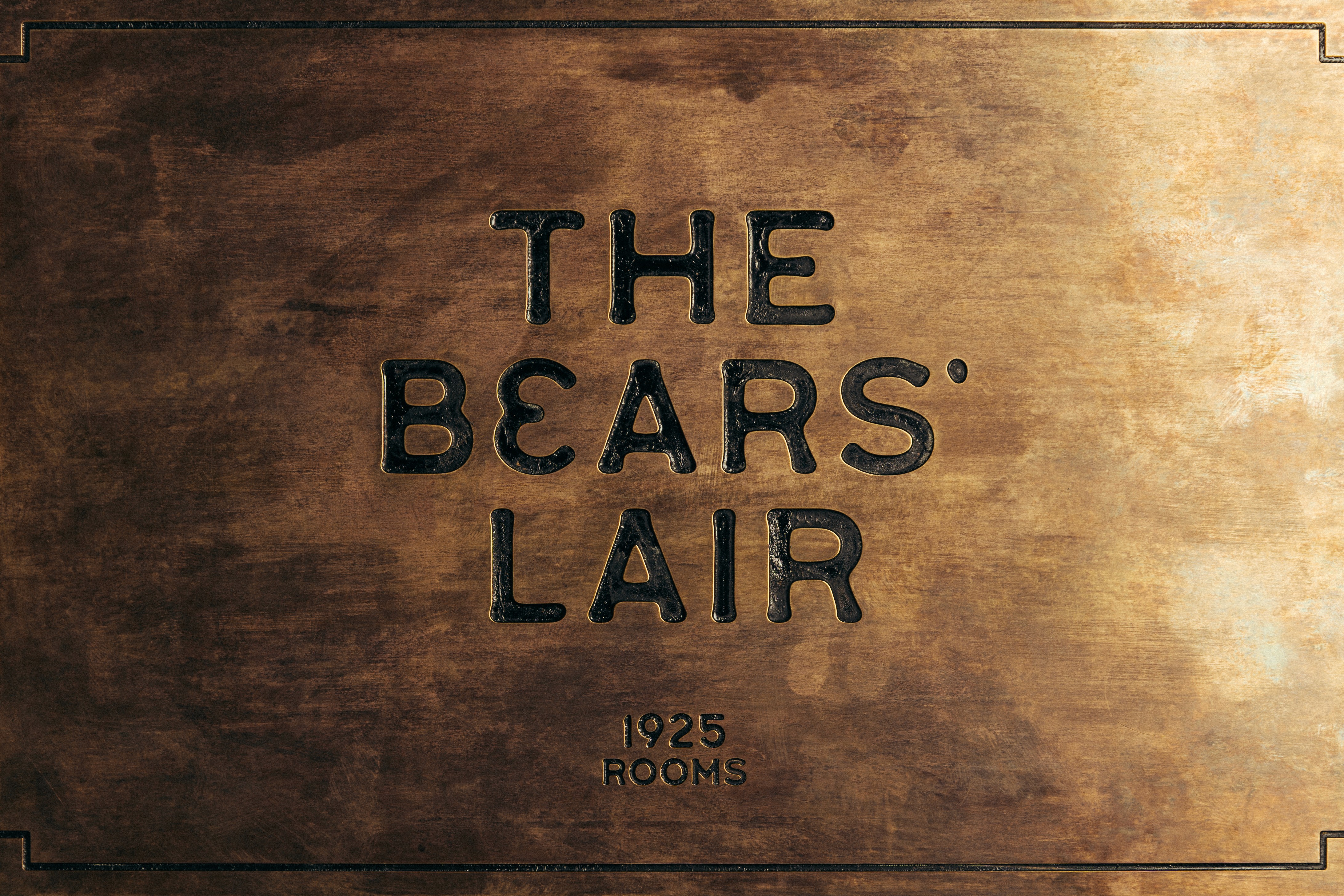
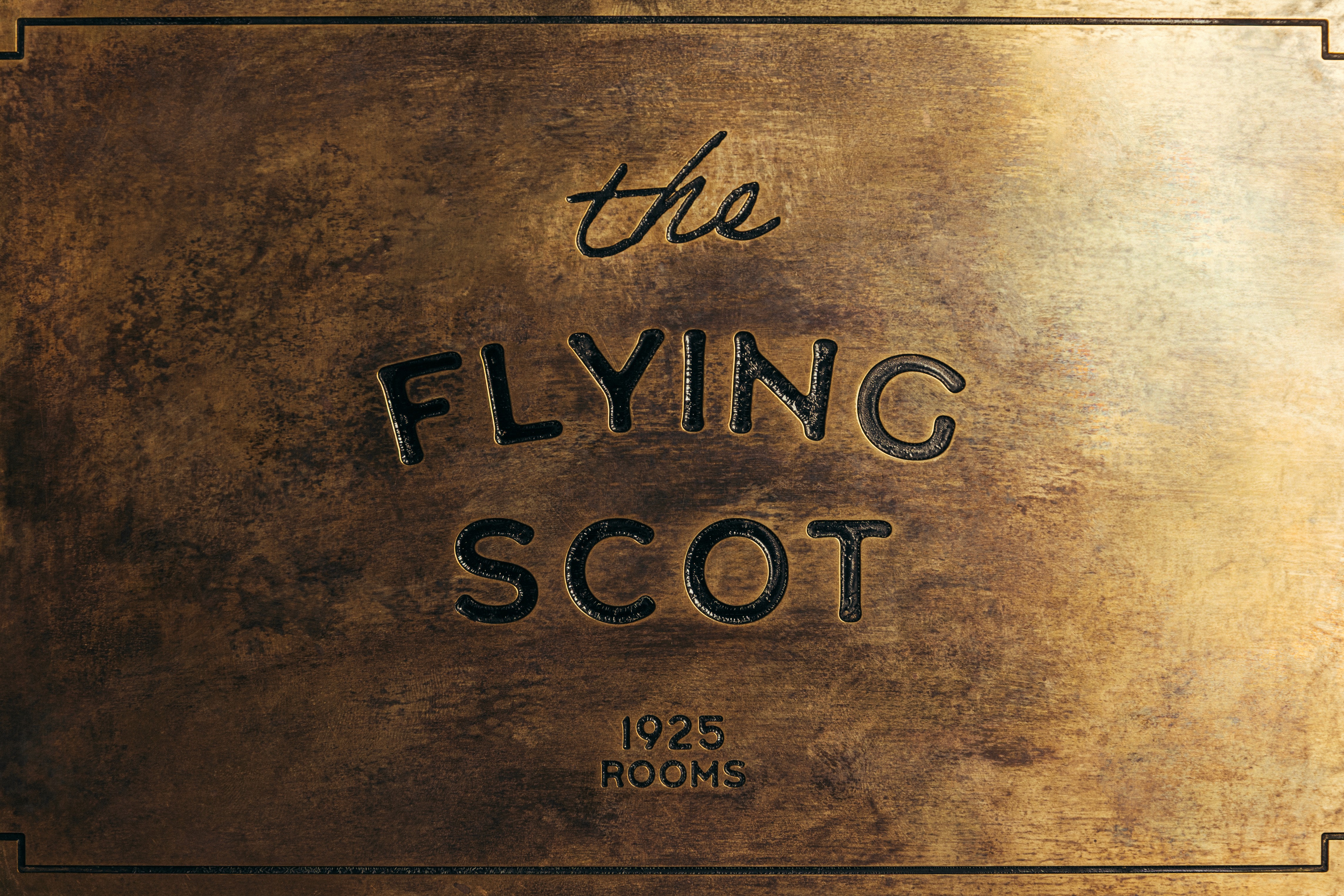
We began by delving into the history of the place itself. The 1925 Rooms were named after the stadium’s founding year and are anchored by two distinct but equally luxurious character-led spaces. The Flying Scot is named after Ian Smith, a central figure in Scotland’s 1925 Grand Slam-winning side whose speed and record-breaking try tally secured his place in rugby history. While The Bears’ Lair is inspired by the Milne brothers — known as The Three Bears — whose strength and presence in the front row made them enduring figures in the game. These narratives form the foundation of the brand, ensuring the identity is rooted in personality and storytelling rather than purely aesthetic reference.
TIMELESS TYPE
Typography plays a central role, influenced by hand-set, slightly-off kilter lettering found in vintage tickets, programmes, and clubhouse boards, and is paired with a warm tonal palette drawn from the luxury interiors designed by Graven.
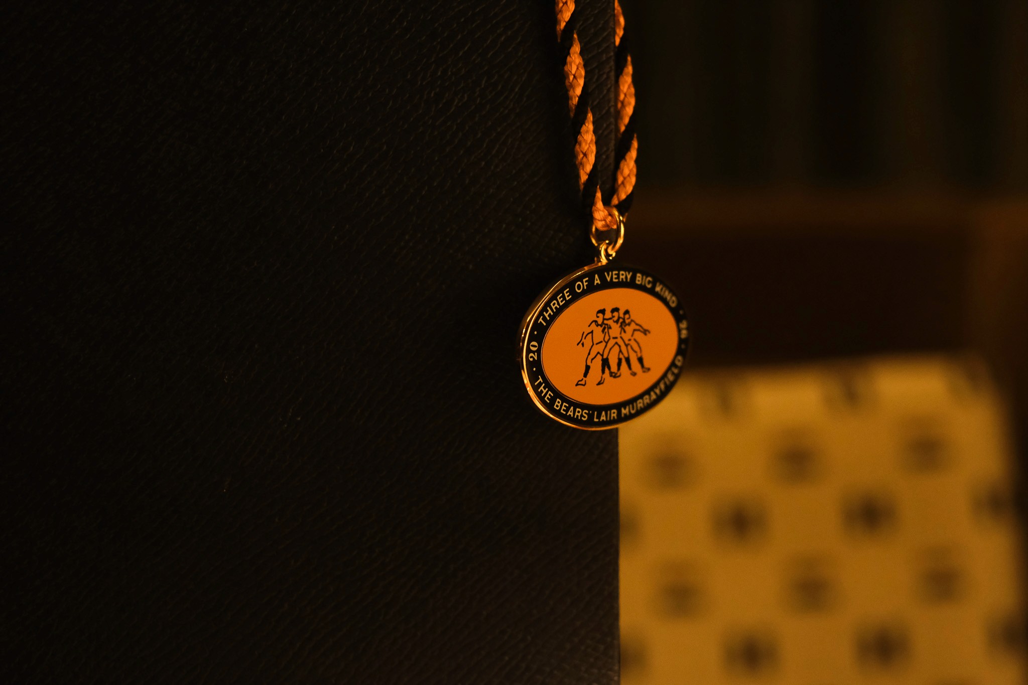
A flexible suite of brand assets was developed for each room, including archival-inspired stamps and badges, illustrated motifs, and supporting typographic phrases. This layered system allows the identity to adapt across applications while maintaining consistency, giving it a collected, curated quality that reflects the archive itself.
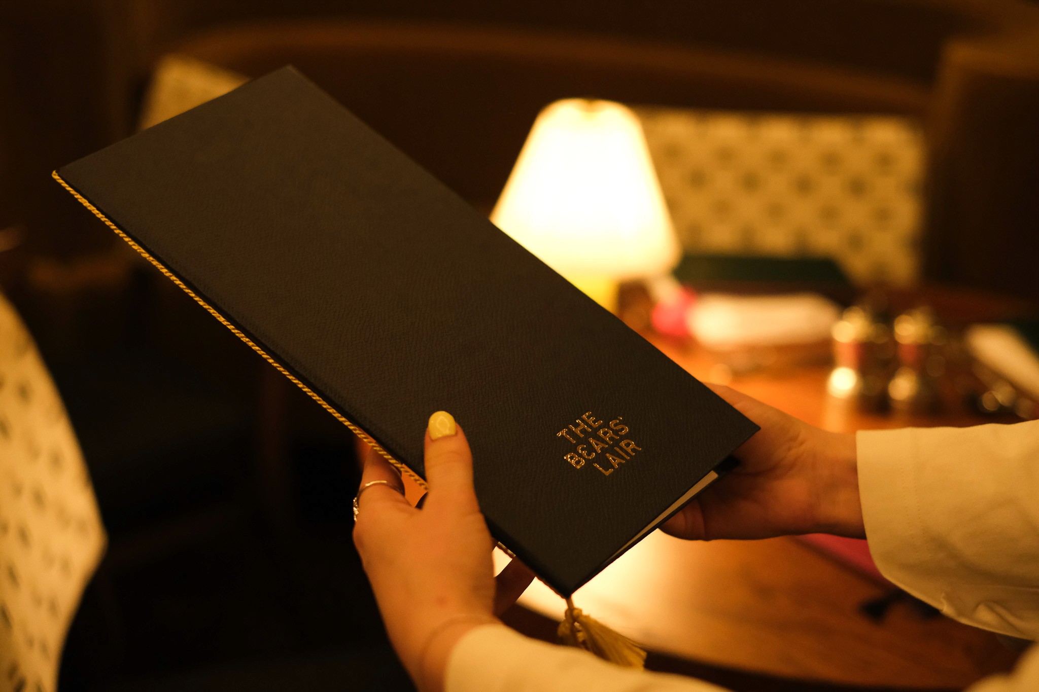
These elements are applied across a wide range of touchpoints, from printed collateral such as menus through to environmental graphics and wayfinding. As a special keepsake for guests, we also reimagined the traditional members’ swing badge as a vintage-style enamel pass.
PREMIUM SIGNAGE
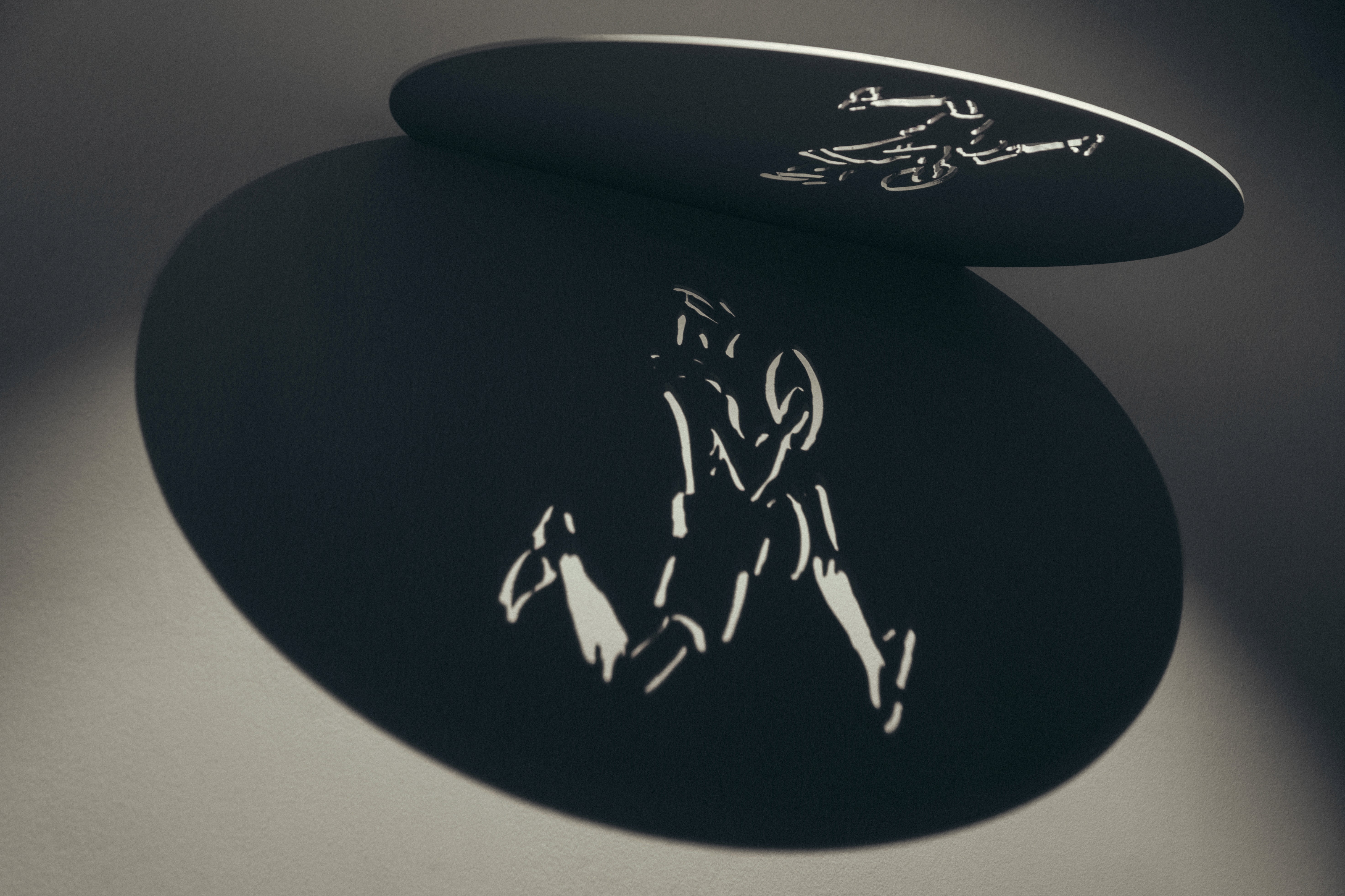
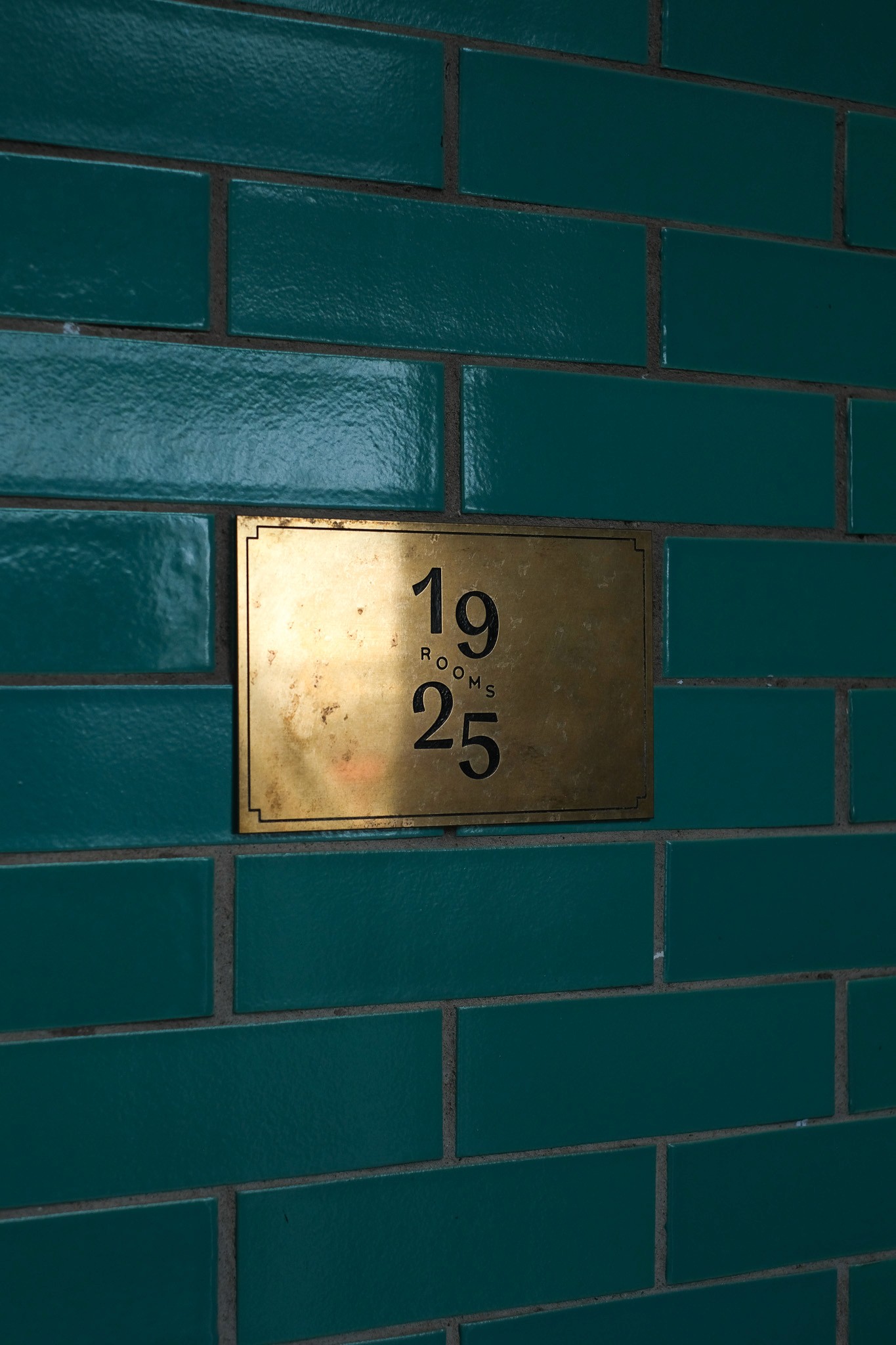
Signage interventions extend the premium, heritage-led experience further. Light projection signage creates a speakeasy atmosphere - activated and deactivated to heighten a sense of exclusivity. This is used alongside engraved and infilled antique brass plaques to reinforce a refined material language.
A SENSE OF ARRIVAL
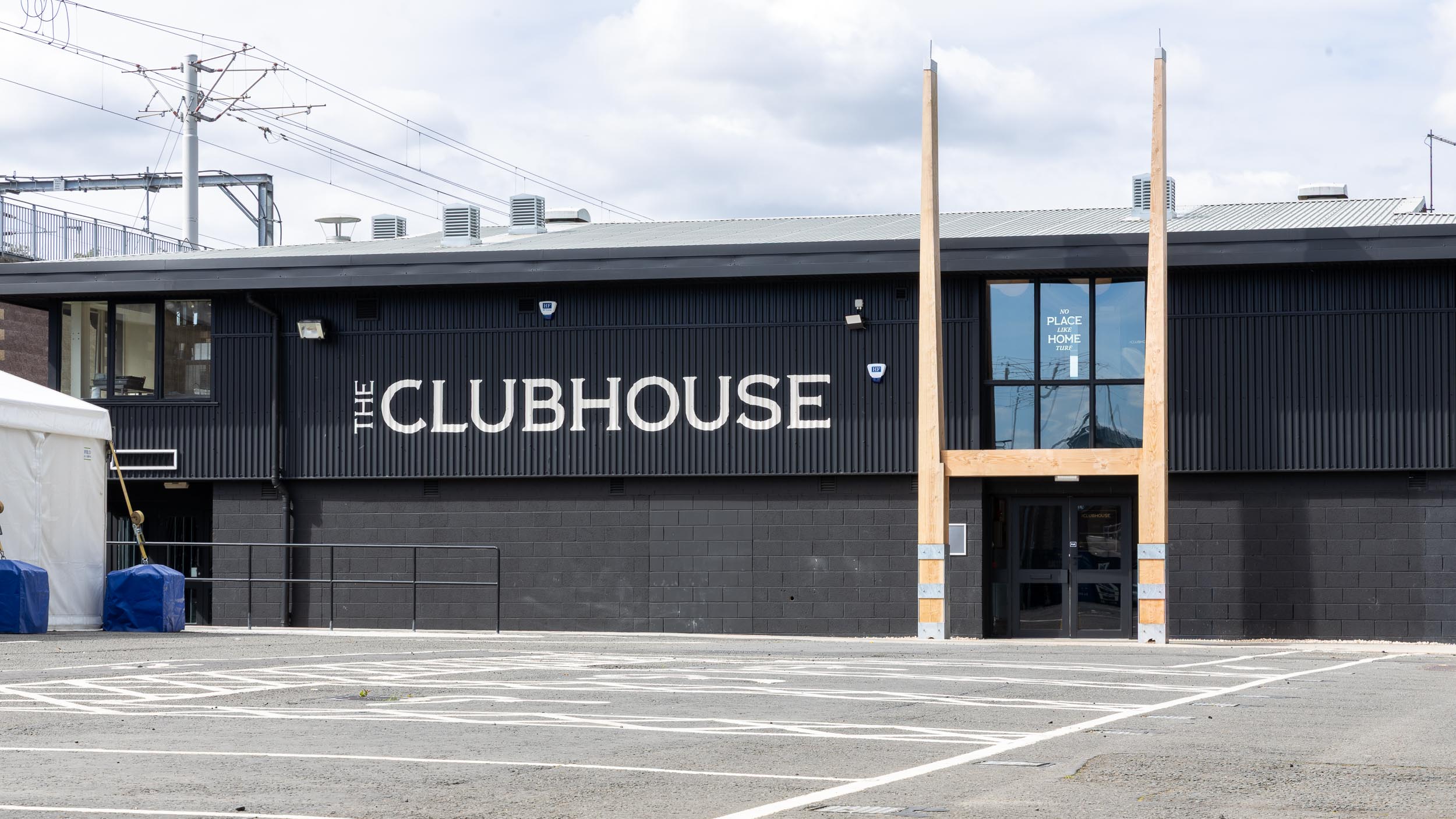
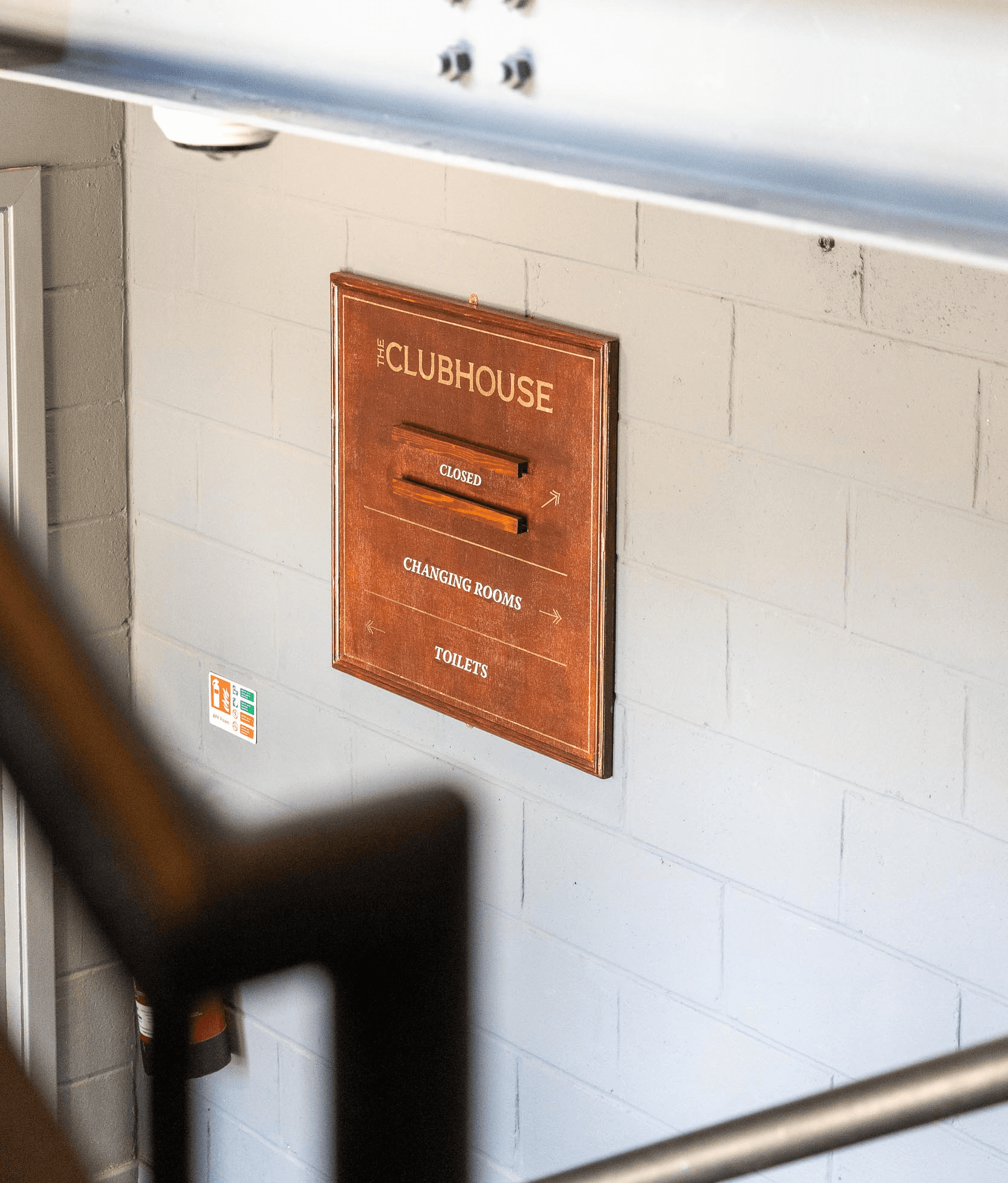
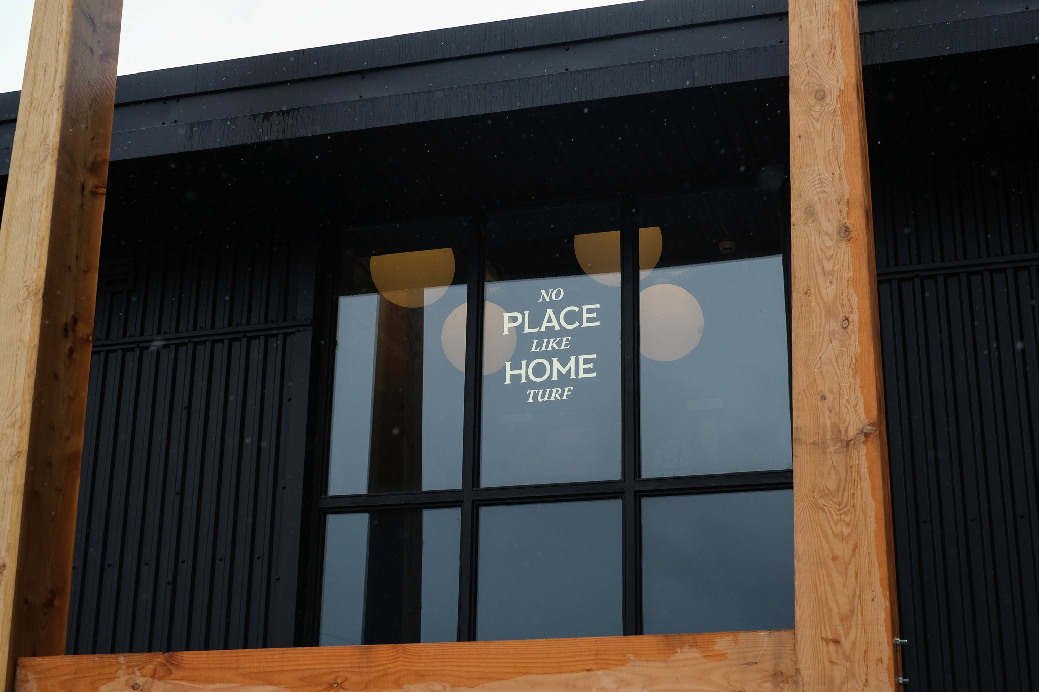
For The Clubhouse, a similar heritage-led approach to signage was taken, introducing gold leaf wayfinding, a statement clubhouse board, and window lettering featuring the brand phrase we developed: “No Place Like Home Turf”.
Externally, oversized white lettering establishes a bold and confident presence within the constrained stadium environment, creating instant visibility and a strong sense of arrival.
Together, the 1925 Rooms and The Clubhouse form a cohesive hospitality experience, honouring a century of sporting history while reimagining it for a contemporary luxury audience.