Turas Mòr
Born from a unique collaboration between a whisky expert and a content creator, Turas Mòr is more than a whisky brand - it’s a movement, rooted in adventure, travel, and community.
Work
- BRAND design
- packaging design
COLLABORATORS
- Francesco Bongiorni

Translated from Gaelic, “Turas Mòr” means ‘great journey’ which is both the name and philosophy of this bold new whisky. Our challenge was to reflect this ethos with a brand world that would break free from traditional, conservative whisky tropes.

our response
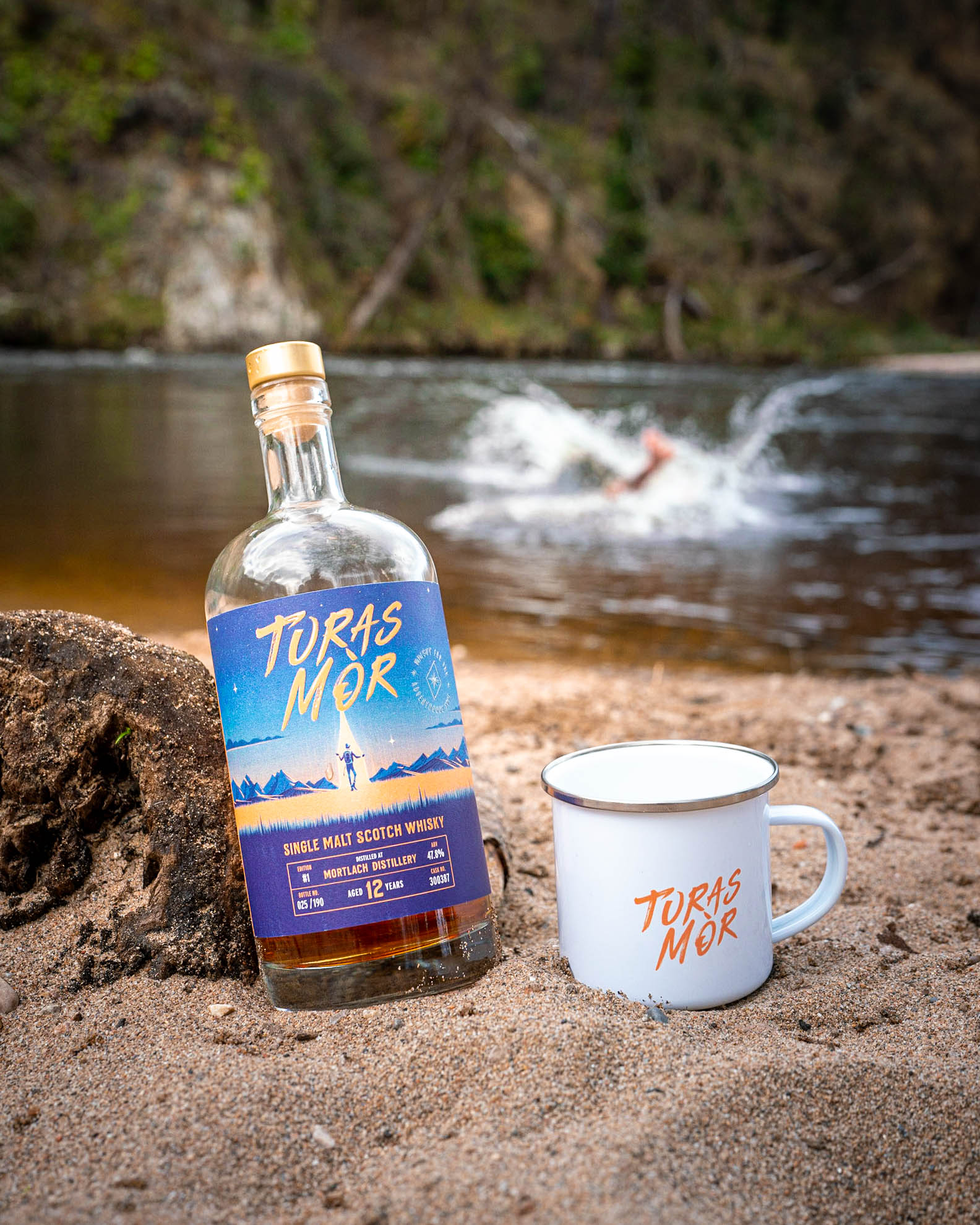
We partnered with founders Mitch and Craig to define and create a visual identity and packaging design for the launch of their brand and debut release: an exclusive small-batch single malt.
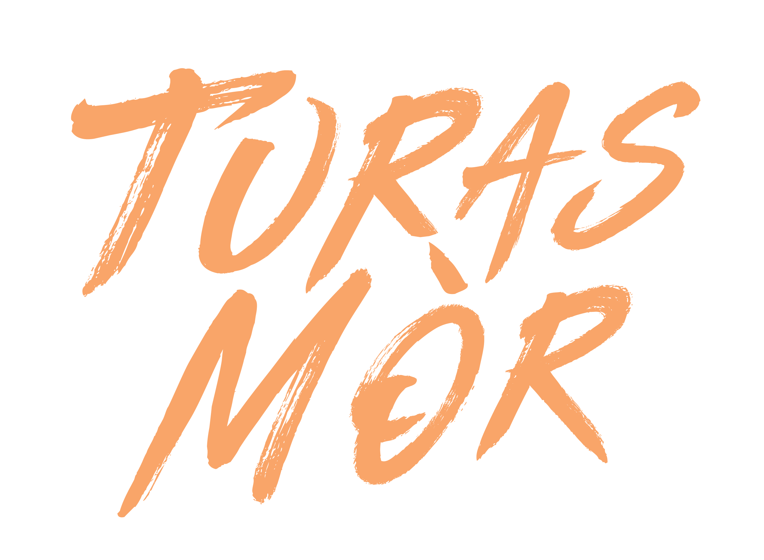
The identity we have created is bold and rebellious, crafted for a new generation of drinkers. The expressive logotype evokes hand-drawn brushstrokes, while a secondary symbol anchors the brand’s spirit of navigation and discovery - featuring a north star wrapped in the tagline “Whisky for the Adventurous Soul”.
The expressive logotype evokes hand-drawn brushstrokes, while a secondary symbol anchors the brand’s spirit of navigation and discovery.


EVOCATIVE ILLUSTRATIONS
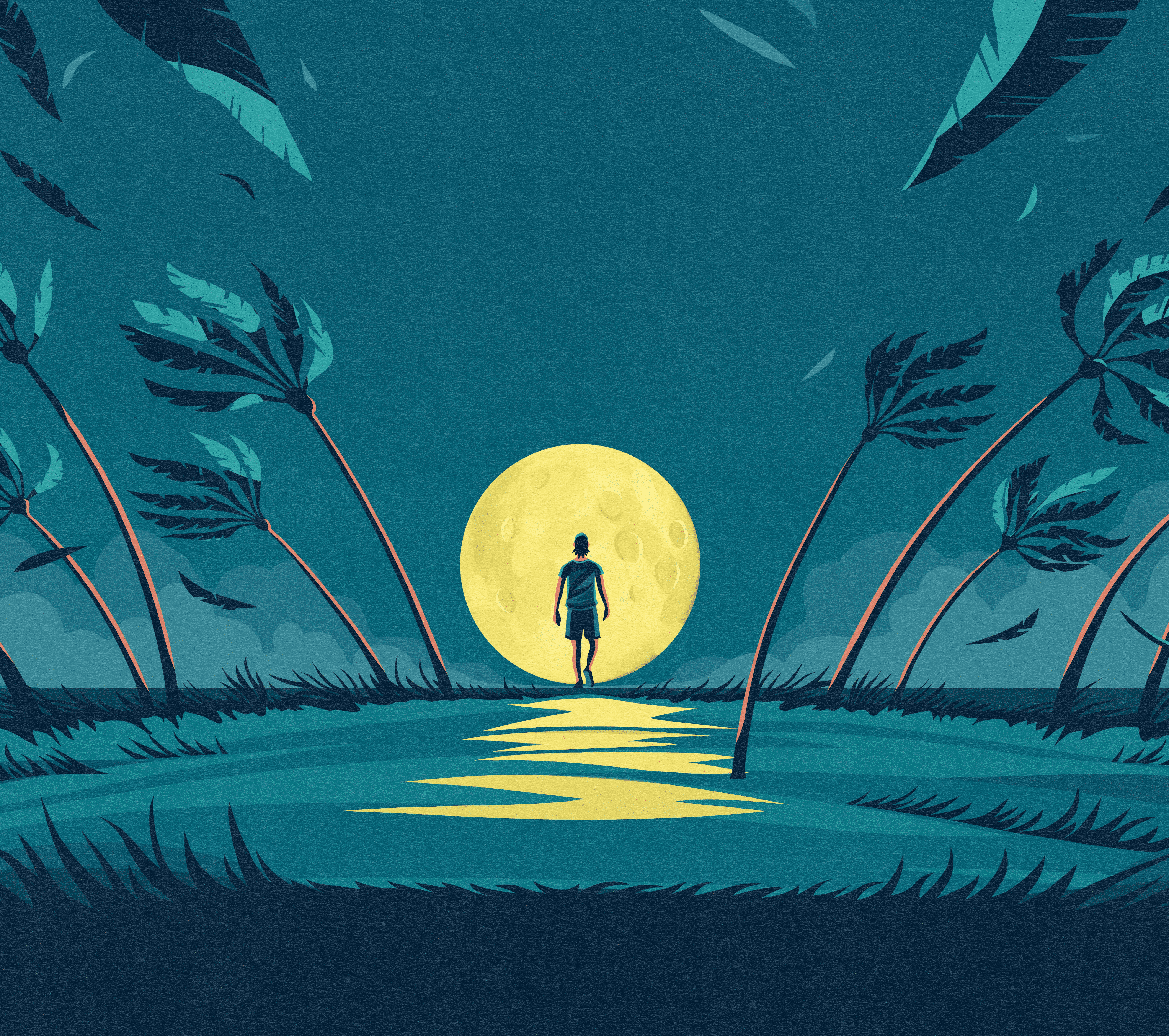
Each release is driven by a hero illustration conveying the brand’s philosophy and passion for the outdoors within an ethereal, other-worldly setting. For the first edition, Madrid-based illustrator Francesco Bongiorni depicted an adventurer amid snowy peaks beneath a star-lit sky. The colour palette draws from nature’s drama: inky blues and fiery ambers. For the second release, he has illustrated our hero emerging from moonlit waters, reflecting a new setting and mood.

REDEFINING THE WHISKY EXPERIENCE
Our branding is helping this rebellious new whisky brand redefine the whisky experience - as wilder and more wonderful, anchored in exploration, shared moments, and the enduring spirit of the journey.
Our branding is helping this rebellious new whisky brand redefine the whisky experience - as wilder and more wonderful…


