Turas Mòr
The Opportunity
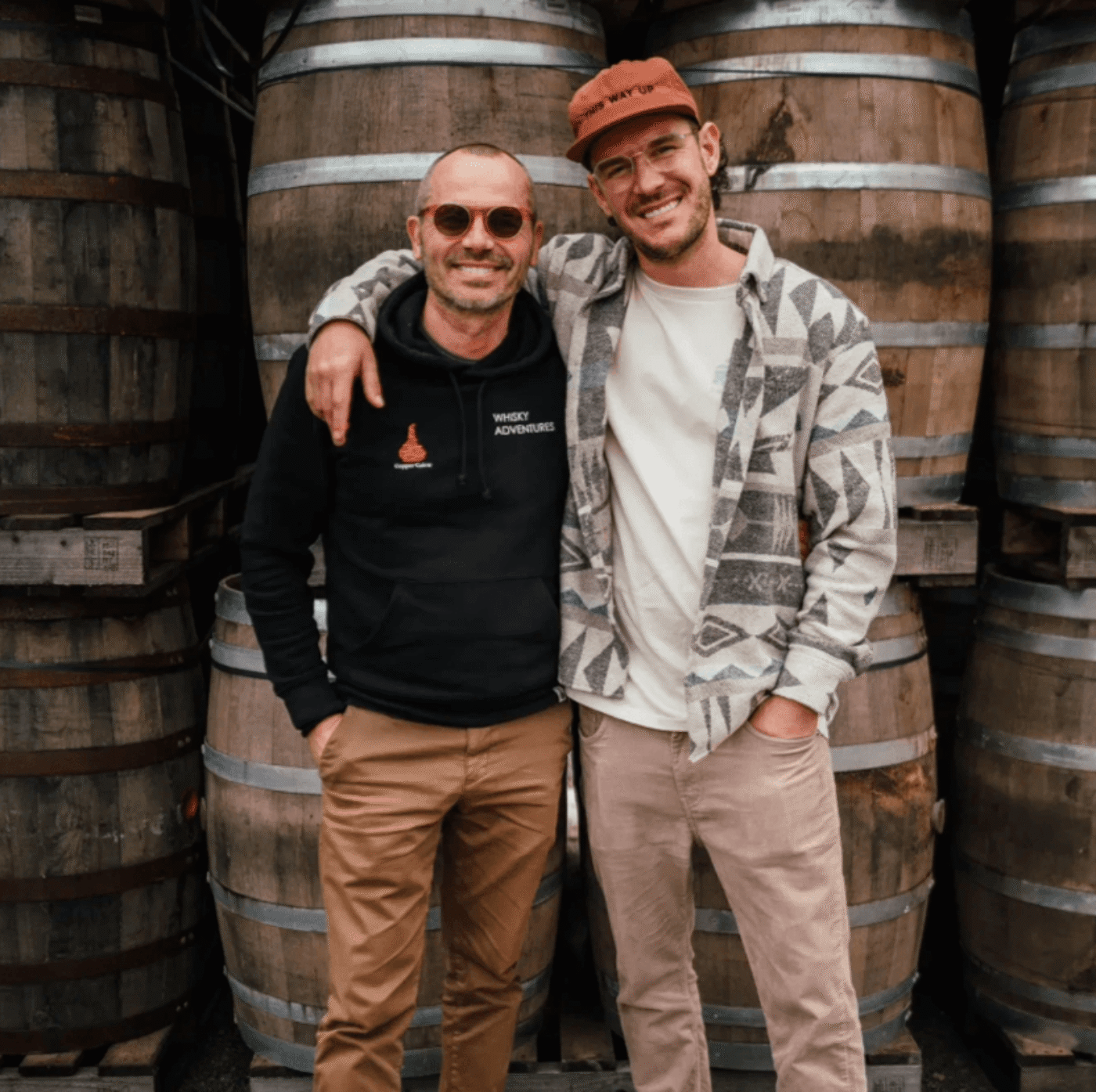
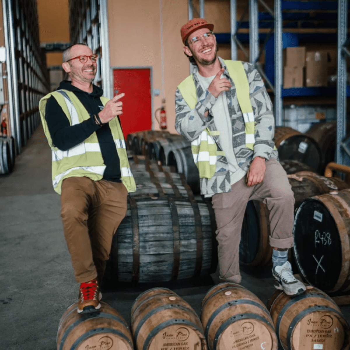
Born from a unique collaboration between a whisky expert and a content creator, Turas Mòr is more than a whisky brand - it’s a movement, rooted in adventure, travel, and community.
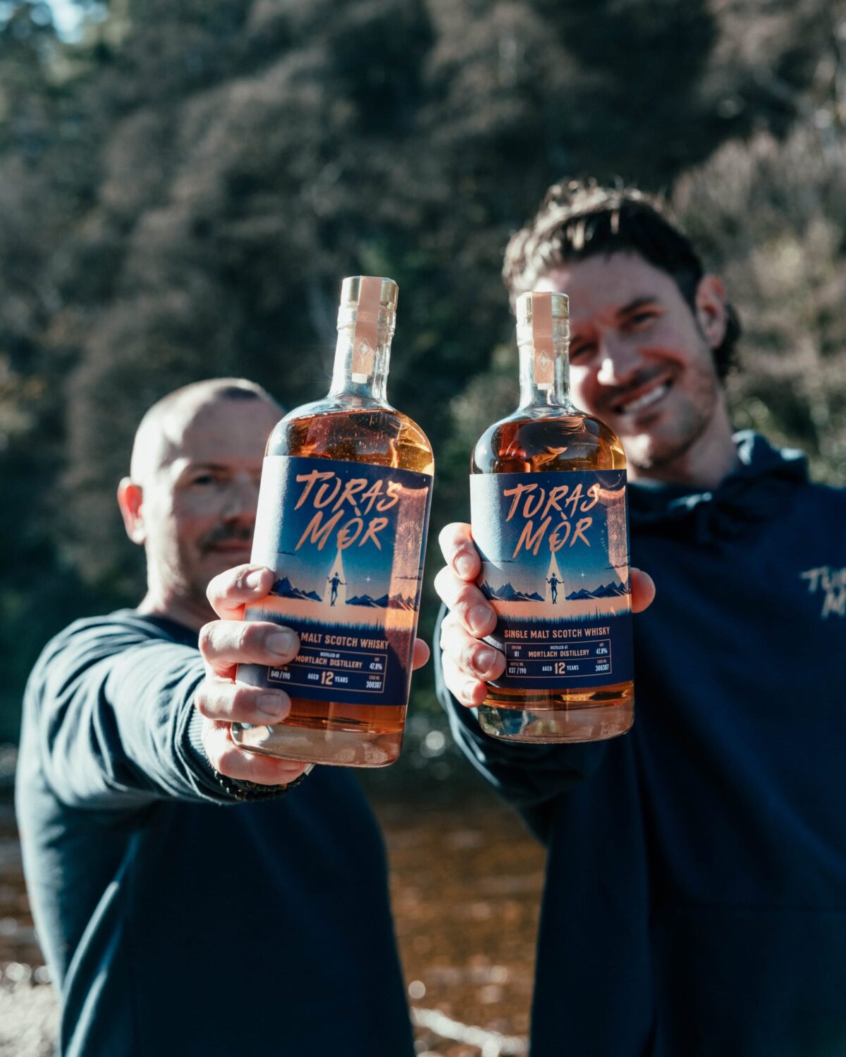
We partnered with founders Mitch and Craig to define and create a visual identity and packaging design for the launch of their brand and debut release: an exclusive small-batch single malt.
Client
Turas Mór
Our work
• Branding
• Packaging Design
Collaborators
• Francesco Bongiorni
Our response
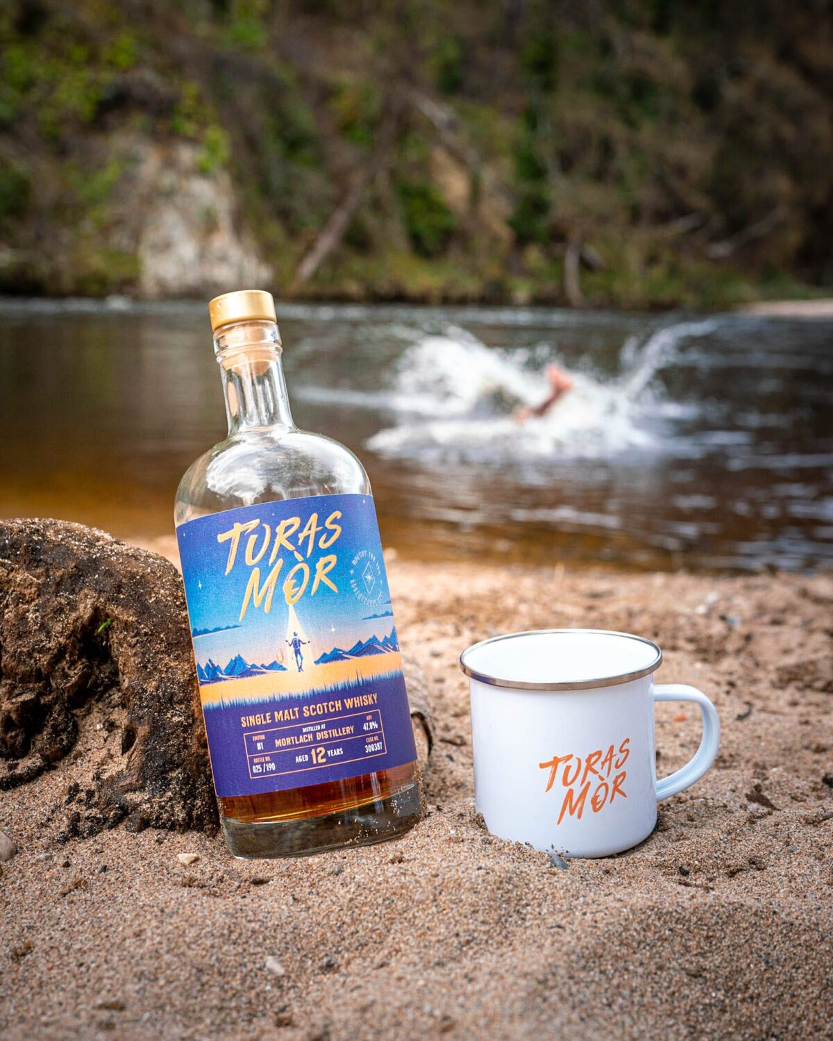
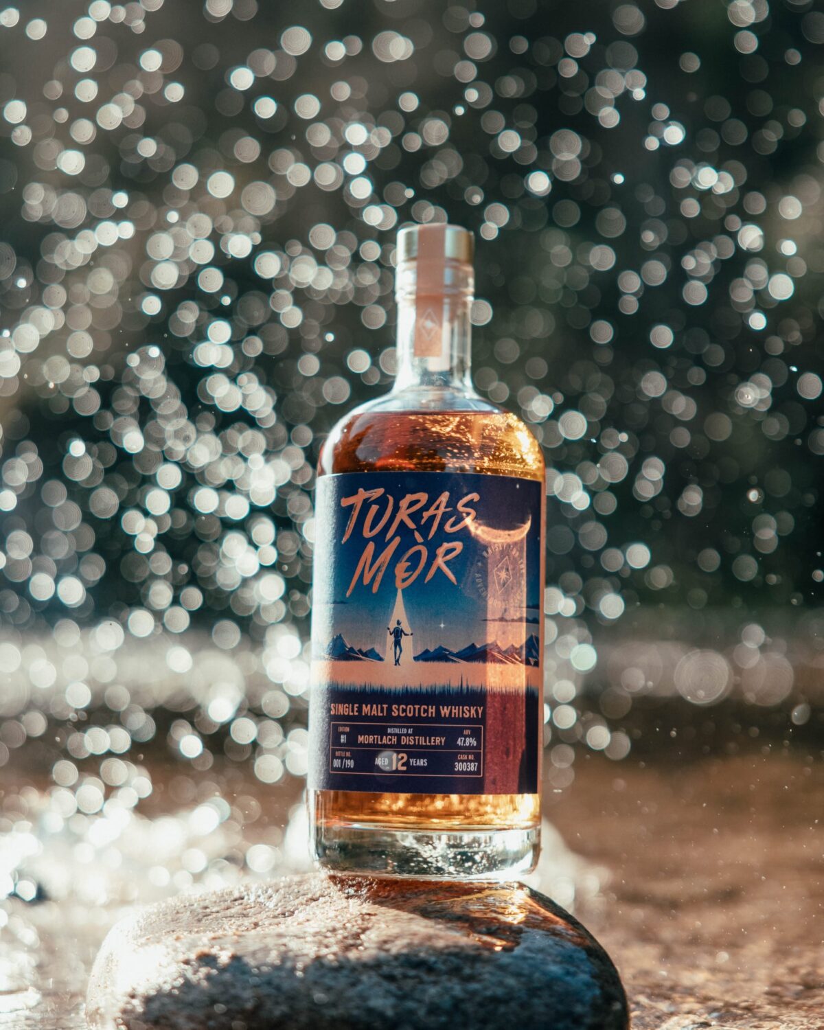
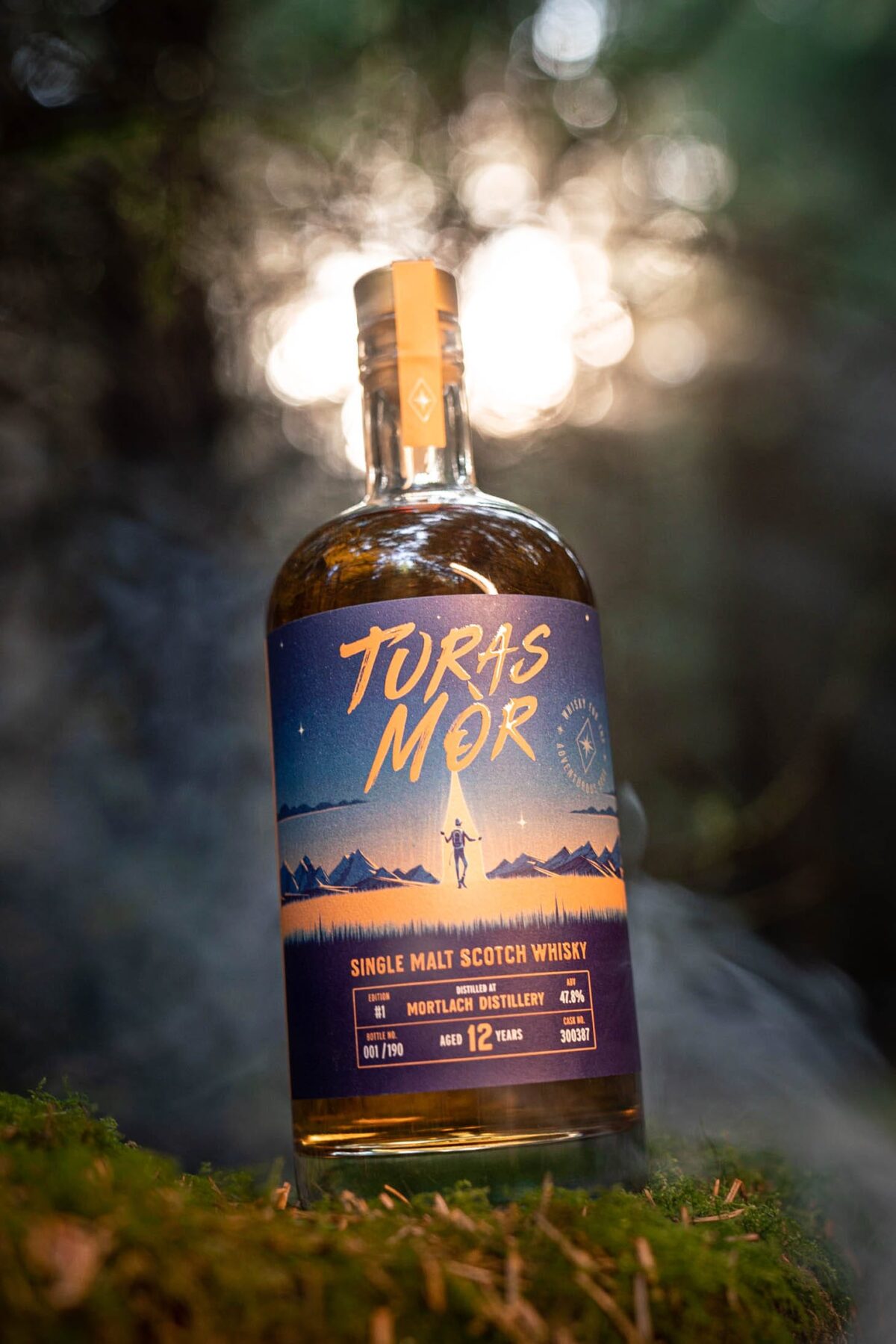
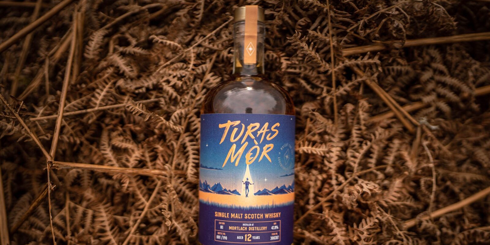
Translated from Gaelic, “Turas Mòr” means ‘great journey’ which is both the name and philosophy of this bold new whisky. Our challenge was to reflect this ethos with a brand world that would break free from traditional, conservative whisky tropes.
The result is a bold rebellious identity crafted for a new generation of drinkers.
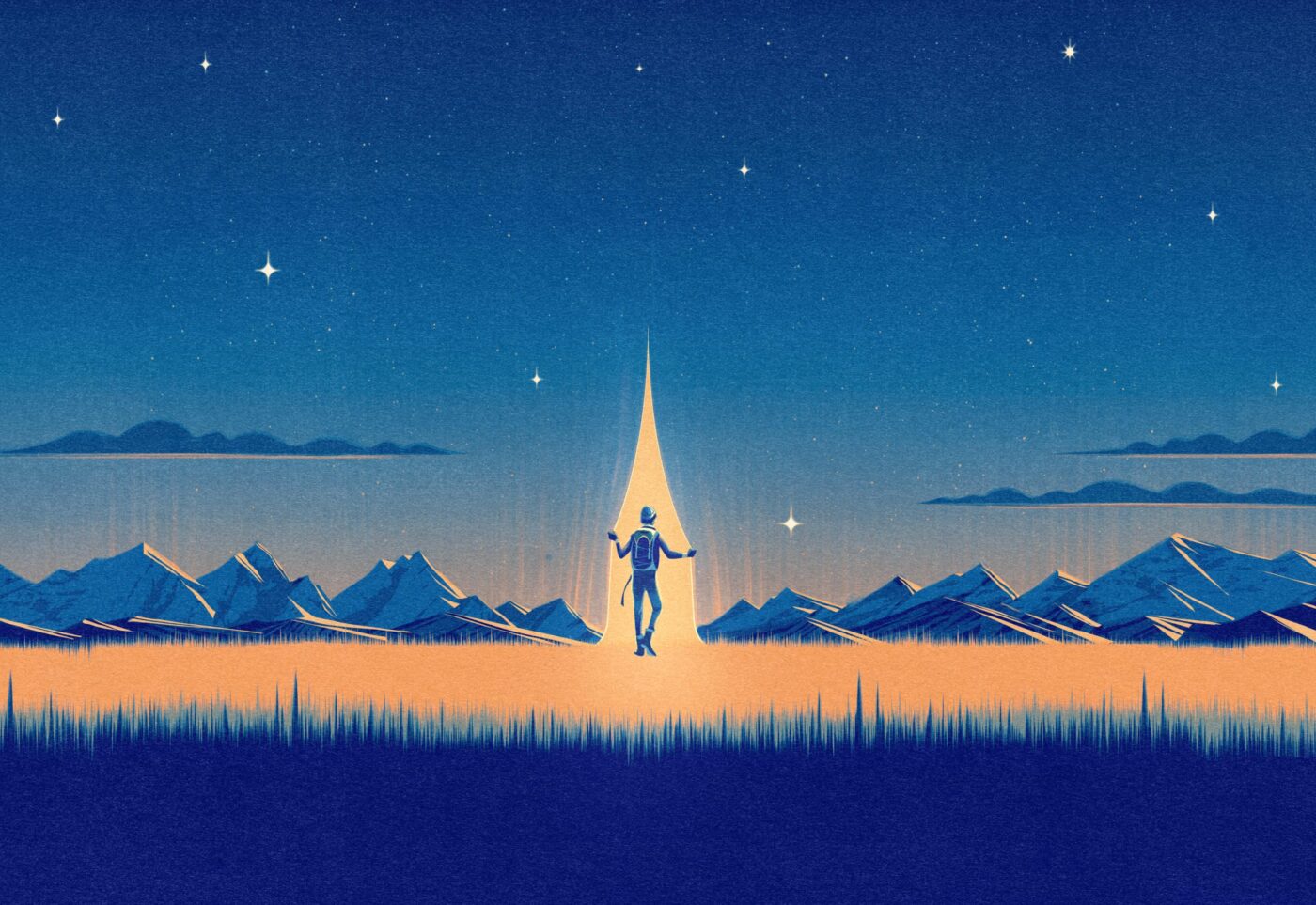
The expressive logotype evokes hand-drawn brushstrokes, while a secondary symbol - featuring a north star wrapped in the tagline “Whisky for the Adventurous Soul” - anchors the brand’s spirit of navigation and discovery.
Each release is driven by a hero illustration conveying the brand’s philosophy and passion for the outdoors within an ethereal, other-worldly setting. For the first edition, Madrid-based illustrator Francesco Bongiorni depicted an adventurer amid snowy peaks beneath a star-lit sky. The colour palette draws from nature’s drama: inky blues and fiery ambers. For the second release, he has illustrated our hero emerging from moonlit waters, reflecting a new setting and mood.
Our branding is helping this rebellious new whisky brand redefine the whisky experience - as wilder and more wonderful, anchored in exploration, shared moments, and the enduring spirit of the journey.